You've felt this before, even if you've never named it. You land on a website — maybe you're comparing a few vendors, maybe you clicked a link from a search result — and within a few seconds, before you've read a word of copy, something in you has already decided whether this business is legitimate. Sometimes that decision is "yes, these people know what they're doing." Sometimes it's "I'm not putting my card details anywhere near this." Either way, it happens fast, and it happens before your conscious brain has caught up enough to explain why.
This isn't a soft, unmeasurable thing. It's been studied directly. Researchers at Stanford, in one of the more cited pieces of work on this, found that people form credibility judgments about a website within roughly fifty milliseconds — before there's been time to read anything at all. That's not a typo. Fifty milliseconds is faster than a blink. Whatever is happening in that window, it isn't reading. It's pattern recognition, and understanding what pattern it's recognizing is genuinely useful if you're the one building the site.
Trust Isn't Earned in the Way You Think It Is
The instinct most business owners have is that trust gets built through content — through testimonials, through an "About Us" page that tells a compelling story, through credentials and certifications displayed prominently. All of that matters, eventually. But it matters in the second phase of trust-building, not the first. The first phase — the fifty-millisecond phase — isn't evaluating your content at all. It's evaluating your competence, and it's doing that through visual cues that have nothing to do with what you're saying about yourself.
Think about what your brain is actually doing in that instant. It's not asking "is this a good business." It's asking something closer to "does whoever made this know what they're doing." And the honest, slightly uncomfortable truth is that your brain answers that second question using signals that have almost nothing to do with the actual quality of the underlying business. A beautifully designed website for a mediocre service will out-trust a poorly designed website for an excellent one, in that first instant, every time. That's not fair, and it's not how we'd design human cognition if we were starting from scratch. It's how it actually works.
What Your Brain Is Actually Scanning For
A few specific things drive that instant judgment, and they're worth understanding individually, because they're mostly fixable.
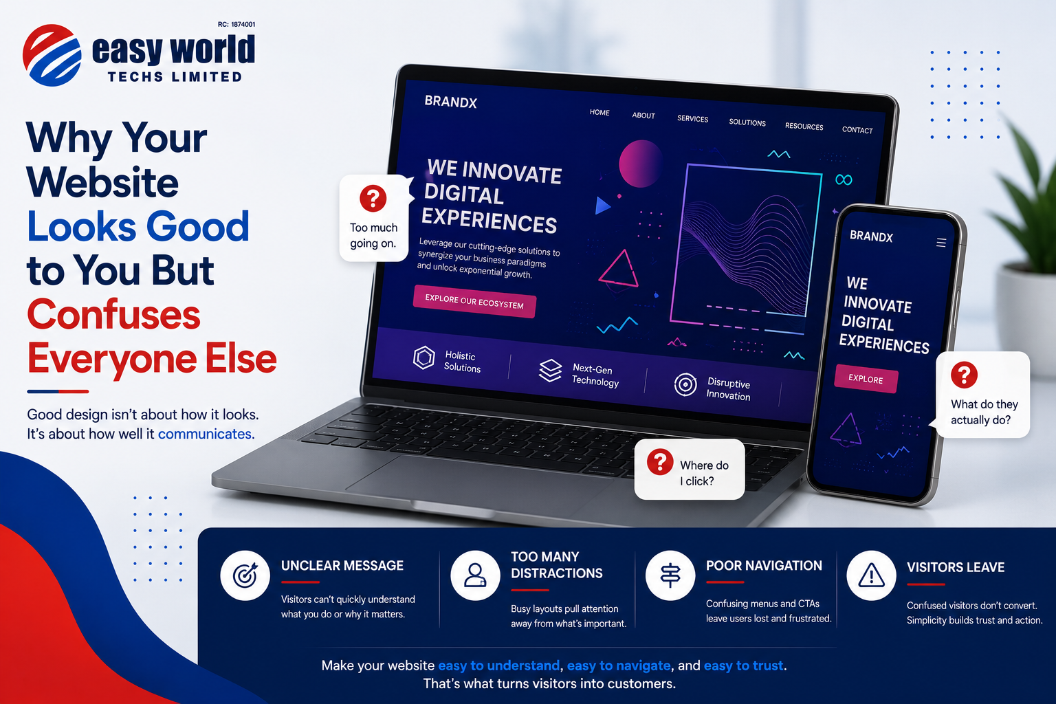
Consistency reads as competence. When fonts, spacing, colors, and button styles are consistent across a page, your brain interprets that as evidence of a coherent, careful process behind the scenes — even though you have no actual information about the process. Inconsistency does the opposite. Three different font weights on one page, buttons that look slightly different from section to section, spacing that's tight in one place and loose in another — none of these individually seem like a big deal, but together they read, almost instantly, as "nobody was paying close attention here." And if nobody was paying close attention to the website, the unconscious inference is that nobody's paying close attention to anything else either — your service, your support, your product.
Whitespace reads as confidence. This one surprises people. A cramped page, where every inch is filled with text, images, and calls to action competing for attention, tends to read as anxious — like the business isn't sure it'll get another chance to convince you, so it's throwing everything at you at once. Generous whitespace does the opposite. It signals that the business trusts its content enough to let it breathe, and that reads, subconsciously, as confidence. This is part of why so many premium and enterprise-facing websites look almost sparse compared to smaller competitors crowding every pixel with offers.
Familiar patterns reduce suspicion. Humans trust what matches an existing mental template and get quietly wary of what doesn't. A navigation menu in the expected place, a logo in the top-left that links back to the homepage, a checkout flow that behaves the way checkout flows usually behave — these aren't creative decisions, and they're not supposed to be. Deviating from them without a very good reason doesn't read as "innovative" to most visitors. It reads as slightly off, in a way people usually can't articulate but definitely notice, and "slightly off" is close enough to "something's wrong here" that it costs you conversions you'll never get an explanation for.
Load speed is trust, not just convenience. This is less about psychology and more about a direct behavioral signal, but it belongs here because of how it gets interpreted. A slow-loading site doesn't just annoy people — it actively damages the credibility judgment before the page has even rendered. A delay reads as neglect: if the business couldn't be bothered to keep its own website fast, what else has it not bothered with?
Why This Matters More in Markets Where Trust Is Already Scarce
There's a layer to this worth naming specifically for the Nigerian market, and we want to be careful to flag this as our read of the landscape rather than something we have hard data behind. Online fraud — fake vendors, cloned websites, scam listings — is common enough here that many people arrive at any unfamiliar business website already primed with a degree of suspicion higher than in markets where online commerce has had longer to mature and fraud has had more time to be pushed back by better enforcement and consumer protection. If that baseline suspicion is higher, the design signals we've described above are doing more work here than they might elsewhere. A website that looks careless isn't just losing a few polish points — it's confirming a pre-existing wariness the visitor arrived with, which makes recovery from a bad first impression harder, not easier.
What This Actually Means for Your Website
None of this is an argument for spending a fortune on design, and it's specifically not an argument for adding more — more badges, more testimonials, more trust seals crammed above the fold, all trying to manually override an instinct that's already been formed by the time someone reads them. The instinct forms first. Content can reinforce it or fight against it, but it can't undo a bad first fifty milliseconds just by saying the right things.
What it is an argument for is treating the unglamorous parts of design — consistency, spacing, adherence to familiar patterns, and plain technical performance — as trust infrastructure, not aesthetic preference. These are the things that get cut first when budgets tighten, because they're the least visible to the person paying for the website. They're also, based on what the research and our own experience both suggest, the things doing the most work in the moment that actually decides whether a visitor sticks around long enough to read anything you wrote about why they should trust you.