We audit a lot of existing websites — usually because a business has called us saying "something's not working" without being able to say exactly what. More often than not, the site isn't broken in any technical sense. It loads, the forms submit, nothing's crashing. What's actually happening is that visitors are hitting small, specific frustrations that individually seem minor and collectively are enough to make someone leave without ever telling you why. Here are the ones we see constantly, in roughly the order we tend to find them. |
01 Contact Information That's Hidden or Missing Entirely
This should be the easiest thing to get right, and it's astonishing how often it isn't. We've audited business websites where finding a phone number requires clicking through to a separate "Contact" page, scrolling past a form, and hunting for a number in small text at the bottom — for a business that exists specifically to be contacted. If someone lands on your homepage ready to reach out, and your phone number, WhatsApp link, or email isn't visible within a few seconds without hunting, you're losing people who were already convinced enough to want to talk to you. That's the most expensive kind of visitor to lose — not someone who needed more convincing, but someone who'd already decided and couldn't figure out how to act on it.
02 Navigation Menus That Don't Match How Visitors Actually Think
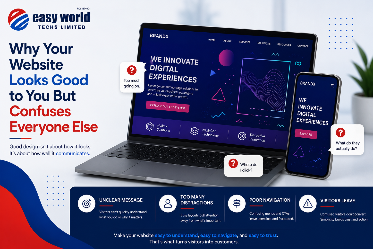
Business owners tend to structure their navigation around how the business is internally organized, rather than around what a visitor is actually looking for. We've seen menus with items like "Solutions," "Offerings," and "Capabilities" as separate top-level items, when a visitor has no idea what distinguishes those categories and has to click into each one just to figure out where their actual question belongs. Menu labels should describe what a visitor will find, in language a visitor would use, not internal company terminology that makes sense to the people who work there and to nobody else.
03 Forms That Ask for More Than They Need
Every additional field on a form is a small tax on whether someone finishes filling it out. We regularly see contact forms requesting name, email, phone number, company name, budget range, and a detailed message, for a business that just wants an initial enquiry. Most of that information can be gathered in a follow-up conversation. A shorter form gets more completions, full stop — this isn't a stylistic preference, it's one of the more consistently measurable findings in web usability research, and yet it's one of the easiest things to fix and one of the most commonly ignored.
04 Buttons That Don't Look Like Buttons
This sounds too basic to mention, and yet. We've seen call-to-action elements styled as plain text, in a color barely distinguishable from the surrounding paragraph, with no visual indication that clicking them does anything. A visitor scanning a page — and most visitors are scanning, not reading carefully — needs to be able to identify, at a glance, what's clickable and what isn't. If your "Get a Quote" button doesn't look different enough from ordinary text to be instantly recognizable as an action, you're relying on visitors to read carefully enough to notice it, and most won't.
05 Mobile Layouts That Were Clearly an Afterthought
A significant majority of web traffic in Nigeria comes through mobile devices, and yet we still regularly find business websites where the desktop version was clearly designed first and the mobile version is a compressed, awkward adaptation of it — text too small to read without zooming, buttons too close together to tap accurately, images that load slowly on mobile data and push content around as they finally appear. If your website wasn't designed mobile-first, or at minimum thoroughly tested on an actual phone under realistic network conditions rather than fast office WiFi, you're very likely delivering a frustrating experience to the majority of the people who visit it.
06 Stock Photos That Actively Undermine Trust
There's a specific category of stock photography — the exaggeratedly diverse office full of people in blazers laughing at a laptop screen, the handshake photo, the generic "African businessman on the phone" image used on a thousand other websites — that visitors have seen so many times it reads as an immediate signal of low effort, even if the visitor couldn't articulate why. This is worth taking seriously: a real photo of your actual office, actual product, or actual team, even if less polished than a stock photo, builds more credibility than a technically nicer image that visitors unconsciously recognize as generic filler.
07 Popups That Interrupt Before There's Any Reason to Trust You
A newsletter signup popup that fires the instant someone lands on your homepage, before they've read a single word about what your business does, is asking for a commitment before earning any trust to justify it. This is one of the more common ways businesses actively work against their own conversion goals — treating every visitor identically regardless of how much they've engaged with the site yet, rather than triggering these prompts based on actual visitor behavior, like someone who's scrolled through most of a page or is about to leave.
08 Text Walls With No Visual Breathing Room
Long, dense paragraphs with no subheadings, no bullet points, no visual breaks, ask a visitor to commit to reading carefully before they've decided your content is worth that commitment. Most visitors scan first and decide whether to actually read based on what that scan reveals. A page that's one unbroken wall of text gives a scanning visitor nothing to grab onto, and the honest result is that most of that carefully written content simply never gets read.
09 Broken or Outdated Content Nobody's Checking
This is the quiet one, and it connects to something we've written about before — a lot of website failure isn't really a design problem, it's a maintenance problem, and this is where that shows up most visibly. Expired promotions still displayed as current. A team page listing someone who left the company two years ago. A "latest news" section with nothing posted since 2023. None of these are design mistakes in the traditional sense, but they land the same way to a visitor — as evidence that nobody's actually paying attention to this website, which quietly undermines trust in everything else on the page, including the parts that are accurate and current.
What Ties All of These Together
None of these mistakes require a rebuild to fix, which is the genuinely good news buried in this list. Most of them are the result of nobody looking at the site from a visitor's actual perspective after the initial build — sitting down with fresh eyes, or better, watching an actual person unfamiliar with the site try to find something on it, and noticing where they hesitate or get stuck. That single exercise, done honestly and repeated occasionally as your site grows and changes, catches most of what's on this list faster and cheaper than any redesign would. |