There is a specific kind of frustration that business owners do not talk about enough.
You invested real money into your website. You went back and forth with the designer over colours and fonts. You rewrote the homepage text three times. You approved the final version, launched it, shared the link with everyone you know, and felt genuinely proud of what you had built. And then — not much happened. Traffic comes in, people look around, and they leave. The enquiries you expected never really materialised.
So you ask a few people what they think of the site. Everyone says it looks great. And that is exactly the problem.
"Looks great" is not the same as "I immediately understood what you do and felt compelled to reach out." Those are two completely different responses and only one of them pays your bills.
Your website probably does look good. That is not the issue. The issue is that you have been looking at it so long, and you know your business so deeply, that you have completely lost the ability to see it the way a stranger does. And strangers are the only people whose opinion of your website actually matters commercially.
This phenomenon even has a name in psychology. It is called the curse of knowledge — the cognitive bias that makes it difficult to remember what it felt like not to know something. Once you know your business inside out, you cannot unknow it. You cannot read your own homepage the way someone reads it for the very first time, with no context, no prior relationship with your brand, and no particular reason to stick around if the first ten seconds do not make sense.
Every decision you made on that website — the language you used, the sections you included, the things you assumed were obvious — was made from the inside looking out. Your visitors arrive from the outside looking in. Those are genuinely different vantage points and they produce genuinely different experiences of the same page.
Here is what that usually looks like in practice.
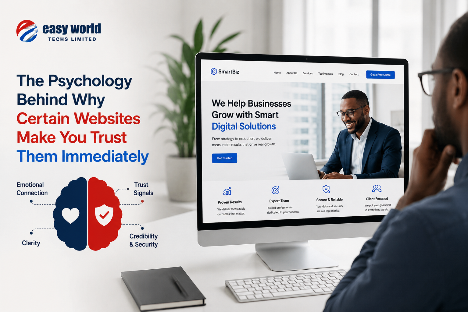
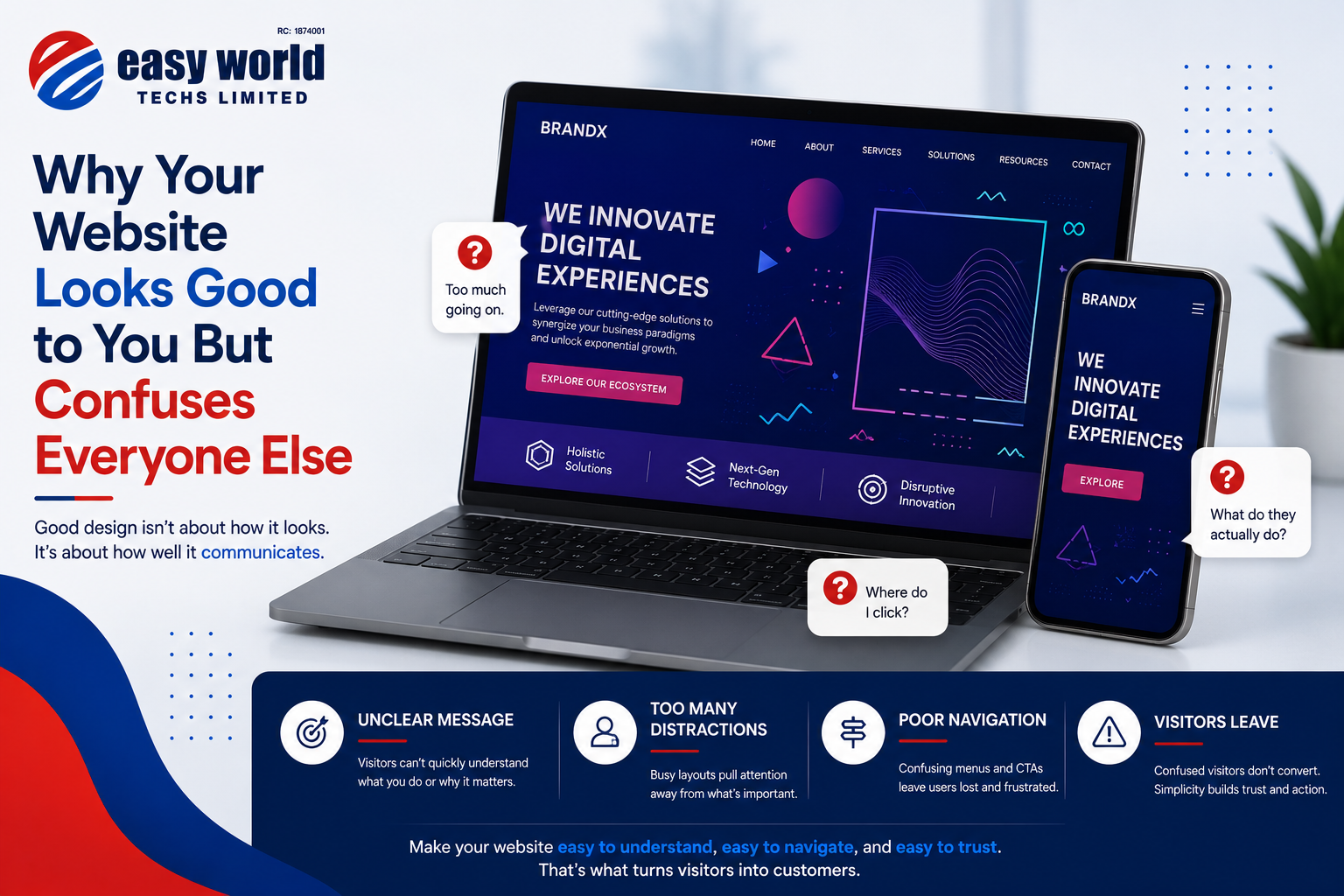
You wrote your homepage headline using the internal language your industry uses. To you and your colleagues it sounds professional and precise. To a business owner who has never worked in your field, it says almost nothing. They cannot tell within the first few seconds whether you solve their problem, so they move on.
You organised your navigation the way your business is organised internally — by department, or by how you think about your own services. Your visitor organises their thinking around their problem, not your structure. They land on your site looking for a solution and cannot find where to look for it, so they give up.
You left out information you consider basic because it feels so obvious that writing it down seemed unnecessary. Your prices, your location, who exactly you serve, what the process of working with you looks like. You did not include these things because you know them so well they did not feel like information worth stating. Your visitor, who knows none of it, is left guessing. People who have to guess usually just leave.
You put things on the homepage because they felt important to you — your founding story, your mission statement, a quote from your director, an overview of your company values. These things mean a great deal to you and your team. A first-time visitor who has a problem they need solved does not want any of that until after they have decided they trust you enough to care. Leading with it is leading with the wrong thing.
You chose images that look beautiful and feel on-brand. Stock photos of smiling professionals in generic office environments, abstract graphics that communicate sophistication, a hero image that looks impressive at full screen. None of it tells your visitor anything specific about what you actually do or for whom. Beauty without information is decoration. Decoration does not convert.
The result of all of this is a website that you and your team look at and see exactly what you intended. It reflects your brand, your voice, your vision. Every element is where you put it deliberately. It looks right to you because your brain fills in all the gaps automatically — gaps that your visitor falls straight through.
There is a test that helps with this and it is almost painfully simple. Find someone who has never heard of your business. Not a friend who is being polite, not a family member who wants to be encouraging. Someone who will give you an honest reaction because they have no emotional investment in sparing your feelings. Show them your homepage for five seconds, then close it and ask them three questions. What does this company do? Who do they do it for? What would you do next if you were interested? If they cannot answer those questions clearly from five seconds of looking, your homepage is not doing its job — regardless of how good it looks.
Most business owners who run this test are genuinely surprised by the results. Not because their website is bad, but because the gap between what they intended to communicate and what a stranger actually received is so much wider than they expected. That gap is the whole problem.
Fixing it is rarely about redesigning everything from scratch. It is usually about shifting your thinking from what you want to say to what your visitor needs to understand. Those are related but they are not the same thing.
Your visitor needs to know within seconds what you do, whether it is relevant to them, and what they should do if they want to take the next step. They need to feel that the person behind this website understands their situation. They need friction removed, not added — a clear path through the page rather than a collection of sections competing for their attention.
When a website is built around those needs rather than the owner's internal perspective, something changes. Not necessarily the visual design. Not necessarily the budget behind it. Just the orientation. Outside in rather than inside out.
The websites that generate enquiries are not always the most visually spectacular ones. They are the ones that make a stranger feel, within the first few moments, that they are in the right place and that the next step is obvious. That feeling is entirely achievable. But you cannot create it by looking at your own website and asking yourself if it looks good.
You already know it looks good. The question worth asking is whether a stranger — landing on it for the first time, with no context and no reason to stay — knows what to do next.
If you are not certain the answer is yes, that is worth looking into.
Easy World Techs Limited designs and builds websites for Nigerian businesses that do more than look good — they communicate clearly and convert visitors into clients. Based in Port Harcourt, Rivers State.