You've probably spent time on it. Clicked around, maybe felt a little frustrated, maybe felt something else entirely — envy, maybe, or the creeping suspicion that you're missing something obvious.
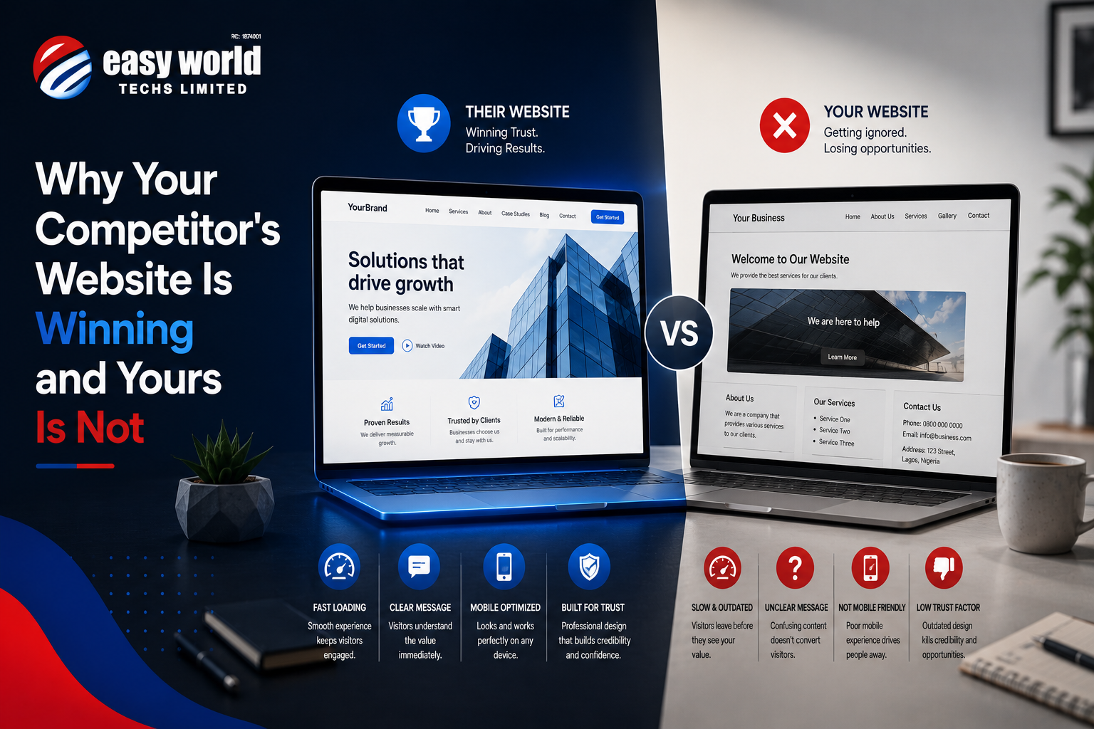
Your competitor's website works. Yours doesn't. Not in the same way.
And your instinct might be to blame design. Or speed. Or "they probably paid some crazy amount for it." But I've spent enough time looking at websites that lose business and websites that win it to tell you: that's almost never the real reason.
The Real Difference Isn't What You Think
Most founders, when they look at a winning competitor website, see what's on the surface. The design is cleaner. The images are better. The layout feels less cluttered. So they think: "We need a redesign."
Then they budget money, find a designer, get something new built, and... nothing changes much. Traffic moves a little. Enquiries stay flat. They're frustrated because they fixed what they thought was broken.
The problem is that a website isn't won or lost because of how pretty it is.
A website is won or lost because of what it communicates and how clearly it communicates it. And that's almost never about aesthetics.
What Your Competitor's Site Is Actually Doing
I sat with a founder in Port Harcourt about three months ago. She sells HR consulting services. She was frustrated because a competitor — someone with less experience, arguably less expertise — was getting more inquiries. Same market. Same service type. Different results.
So I spent time on both websites. Hers was newer, actually. Professionally designed. Responsive. All the boxes checked.
Here's what I noticed:
On her website, you landed on the homepage and saw: "Strategic HR Solutions for Nigerian Businesses." Below that, a row of three icons. "Recruitment," "Training," "Compliance." Then a "Learn More" button that took you to a services page with paragraphs of text about each service.
On the competitor's website, you landed on the homepage and saw: "We help Port Harcourt manufacturing companies hire the right people 40% faster."
One sentence. Specific to a place. Specific to a problem. Specific about an outcome.
Then the site walked you through something like: "Here's what we found about how you're hiring now → Here's what changes when you work with us → Here's what that means for your business → Here's what clients say happened after → Here's how to start a conversation."
It wasn't prettier. But it was clearer about who it was for and what it would do.
The Three Things Winning Sites Do That Losing Ones Don't
1. They Know Exactly Who They're Talking To
This is where almost every website fails. They try to appeal to everyone. "We work with businesses of all sizes." "All industries." "All challenges."
Your competitor's winning website talks to someone specific. Not everyone. Someone.
Manufacturing company in the Lagos industrial belt? Fintech startup bootstrapped with less than $50K? A fashion retailer struggling with inventory? Each of these is a different person with a different problem. A website can't speak clearly to all of them at once.
When you try, you end up with generic language. "We provide comprehensive solutions." Nobody reads that and thinks, "Yes, that's exactly what I need." They read it and move on.
The winning site picks one. "We work with mid-market manufacturing companies," or "We help fintech startups in their first three years." And then every word on that site is written for that person. Every example. Every case study. Every explanation of how things work.
It feels narrow when you're building it. It feels like you're leaving money on the table. You're not. You're actually picking the table you're going to win at.
2. They Explain Their Thinking, Not Just Their Service
Here's something I notice about losing websites: they describe what they do.
"We build custom software." "We provide cybersecurity consulting." "We design brand identities."
Your competitor's site explains why that matters.
Not in an abstract way. In a concrete way tied to what happens to you if you don't address it.
Example: Instead of "We provide cybersecurity consulting," the winning site might say: "Most small Nigerian businesses think a strong password and an antivirus subscription are enough. They're not. Last year, we saw three clients in your industry get hit with ransomware because they didn't have proper access controls. All three lost a month of operations and spent between 2 and 6 million naira recovering."
That's not prettier. That's not more clever. But it does something the first version doesn't: it makes you realize there's actually a problem you might have forgotten about or didn't fully understand.
Then it explains what you'd do about it. Not in service-speak. In real terms: "Here's what we'd audit. Here's what we'd probably find. Here's what we'd fix first. Here's why that order matters."
You're not reading about a service. You're reading someone who understands your world explaining what's broken in it and how they'd fix it.
3. They Make It Easy to Know What to Do Next
This is almost mechanical, but it matters more than people realize.
At every point on the winning site, you know what you're supposed to do. Read this. Click here. Fill this form. Call this number. Schedule a time. There's always a clear next step.
Losing websites hide this. The "next step" might be buried in footer. Or it's unclear whether you should email, call, book a time, or read more first. You end up leaving because the friction of figuring out what to do feels higher than the desire to learn more.
The winning site assumes: "You might be interested, but you're busy. You don't have time to figure out how to contact me. Make it stupid simple."
So there's a button. Not "Submit" or "Get Started" (those feel vague). Something specific: "Book a 30-minute strategy call," or "Send us your brief and we'll respond in 48 hours," or "Download the checklist."
It tells you what will happen next and removes the guesswork.
Why This Matters More Than You Think
Most founders I talk to assume their website doesn't work because they don't get enough traffic. But that's often not actually the constraint. The constraint is that the people who do visit don't convert to enquiries. Or they convert to enquiries but not to clients.
Traffic without clarity is just noise.
If your site pulls 200 visitors a month and converts 2 of them, you have a clarity problem, not a traffic problem. You could double your traffic and still lose money because you're not actually communicating value.
Your competitor's site might get fewer visitors. But each visitor understands: "This is for me, and here's what it would do, and here's how I talk to them." So a higher percentage of those visitors become enquiries. And a higher percentage of enquiries become clients.
That's not luck. That's strategy built into the site itself.
What This Means for Your Site
Before you redesign or rebuild, answer these questions honestly:
Who are we actually best at serving? Not who could we serve. Who do we serve better than anyone else? One industry? One company size? One specific problem? Name it. Own it.
What problem do they have that they might not fully realize they have? Your competitor's site works because it's not just saying "we can help you hire." It's saying "here's what's broken in how you're hiring, and here's the specific impact it's having on your business." What's the thing you see that your clients don't always see when they first contact you?
What should someone do if they think they need help? Not "contact us." Be specific. "Email me a description of what you're facing and I'll get back to you in 24 hours with an assessment." "Book a 30-minute call here." "Read this guide first, then we'll know if there's a fit."
If your answers to these are fuzzy, that's why your site isn't winning. It's not because it's not pretty enough. It's because no one visiting it actually understands who it's for and what they're supposed to do about it.
Your competitor figured that out. That's the only advantage they have.
What's your actual biggest frustration with your website right now? Not the thing you think you should say, but the real one. Send it over. Sometimes the thing that feels like a traffic problem is actually a clarity problem in disguise.