Let me tell you about a conversation that stuck with me.
A client called us sometime in early 2024 — an accounting firm based in Port Harcourt that had been in business for years. Good reputation, solid client base, experienced partners. By every measure, a successful practice. But the principal called because something was bothering him. He kept losing prospective clients to younger, smaller firms that — by his own admission — were not as competent as his team. He could not figure out why.
We asked him one question. When was the last time you looked at your website the way a stranger would?
He went quiet for a moment. Then he said he would call us back.
He called back the next day and said he wanted to meet.
What We Found When We Looked
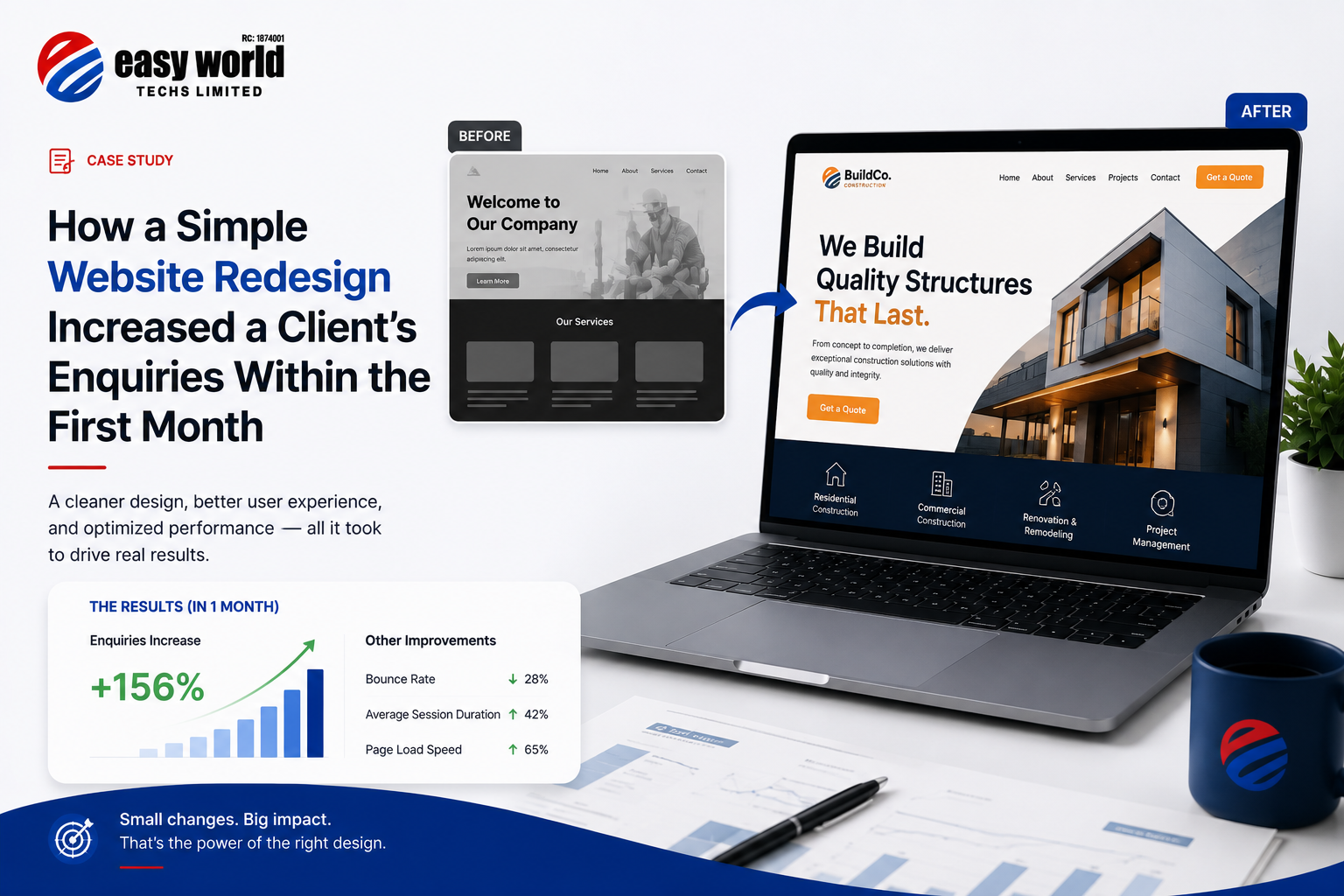
When we audited the site, the picture became clear very quickly. The website had been built several years earlier and nobody had touched it since. Not the content, not the design, not the structure. It was still running on an outdated theme, the mobile experience was broken on several pages, the homepage said almost nothing useful about what the firm actually did or who it served, and there was no clear action for a visitor to take. No prominent phone number. No contact form above the fold. The services page was a single paragraph of dense text that read more like a legal document than a conversation with a potential client.
The firm was spending money on referrals and word of mouth — which was working — but any prospective client who received a recommendation and went to check the website first was getting the wrong impression entirely. In some cases they were probably walking away before ever making contact.
The website was not generating enquiries. It was quietly killing them.
What We Actually Changed
This was not a ground-up rebuild. The client did not need or want a lengthy project. What he needed was a focused redesign that fixed the real problems without reinventing everything.
We restructured the homepage completely. Instead of opening with a paragraph about the firm's history — which nobody reads first — we led with a clear, direct statement of what the firm does, who it serves, and why it matters. Something a visitor could understand in ten seconds without scrolling.
We added a visible call to action in the first screen. A simple button. Book a consultation. That was it. But it was there, it was prominent, and it went somewhere useful.
The services section was rewritten and broken into clearly separated offerings with enough detail for a prospective client to recognise their own situation in what they were reading. We were not writing for search engines. We were writing for a business owner sitting at their desk at 9pm wondering if they needed an auditor.
We sorted the mobile experience. Pages that were previously broken or cramped on a phone were rebuilt to load cleanly and read comfortably. Given that a large share of the firm's prospective clients would be viewing on mobile, this alone was significant.
We introduced a consistent visual identity — clean typography, a professional colour palette, proper use of whitespace. Nothing flashy. The goal was credibility, not cleverness. An accounting firm's website should make you feel like your money is safe with these people. That is the only job it has.
We added a short section featuring the firm's regulatory affiliations and professional memberships — ICAN, FRCN, and others. For a prospective client evaluating multiple firms, these markers of professional standing matter enormously and the previous site had buried them in the footer where nobody would see them.
Finally, we compressed and optimised every image on the site and configured caching properly. Load time dropped significantly. The site went from feeling sluggish to feeling immediate.
What Happened After Launch
The client sent us a message about two and a half weeks after the new site went live. He had received three new enquiries that week from people who had found the firm online and filled in the contact form. In the previous months, the contact form had been effectively silent.
By the end of the first month, he counted seven enquiries that had come directly through the website. Two of them converted into active clients within that same period.
He told us something interesting. One of the new clients mentioned during their first meeting that they had looked at two other firms before deciding to reach out to his. When he asked what made them choose his firm, they said the website felt more professional and trustworthy than the others. The work had not changed. The team had not changed. The price had not changed. The website had changed.
What This Actually Demonstrates
We are not sharing this to suggest that a website redesign is a magic fix for every business problem. It is not. There are firms with beautiful websites and empty appointment books, and firms with terrible websites that cannot keep up with demand.
But there is a specific scenario where a redesign produces fast, measurable results — and that is when the existing website is actively working against a business that is otherwise doing everything right. When the reputation is there, the service quality is there, the pricing is competitive, but the first digital impression is costing you conversations you never even know you are losing.
In that situation, the gap between what the business actually is and what the website communicates is the entire problem. Close that gap and things change quickly.
Three Questions Worth Asking Yourself
If you run a service business and your website has not been updated in the last two to three years, ask yourself these honestly.
Does your homepage communicate what you do and who you serve within the first ten seconds — without scrolling?
Is there a clear, obvious action for a visitor to take when they are ready to reach out?
If someone received a referral to your business and checked your website before calling, would what they find make them more or less likely to follow through?
If any of those answers make you uncomfortable, the website is worth looking at seriously.
A Note on Scope
The redesign we delivered for this client was not a six-month project. It did not require rebuilding everything from scratch or a large budget. It required honest diagnosis, clear priorities, and focused execution. We identified the specific things that were undermining the site's ability to convert visitors into enquiries and we fixed those things.
That is usually how this kind of work goes. The problems are rarely mysterious once you look at the site the way a stranger would.
Easy World Techs Limited helps businesses across Nigeria build and improve their digital presence. If your website is not generating the enquiries your business deserves, let us take a look.